Kaleidoscope 2020

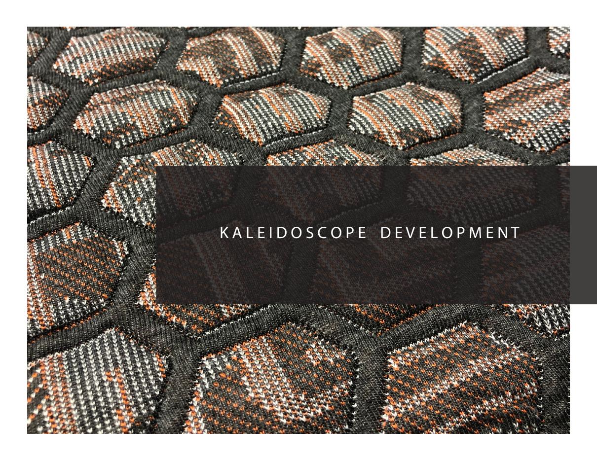
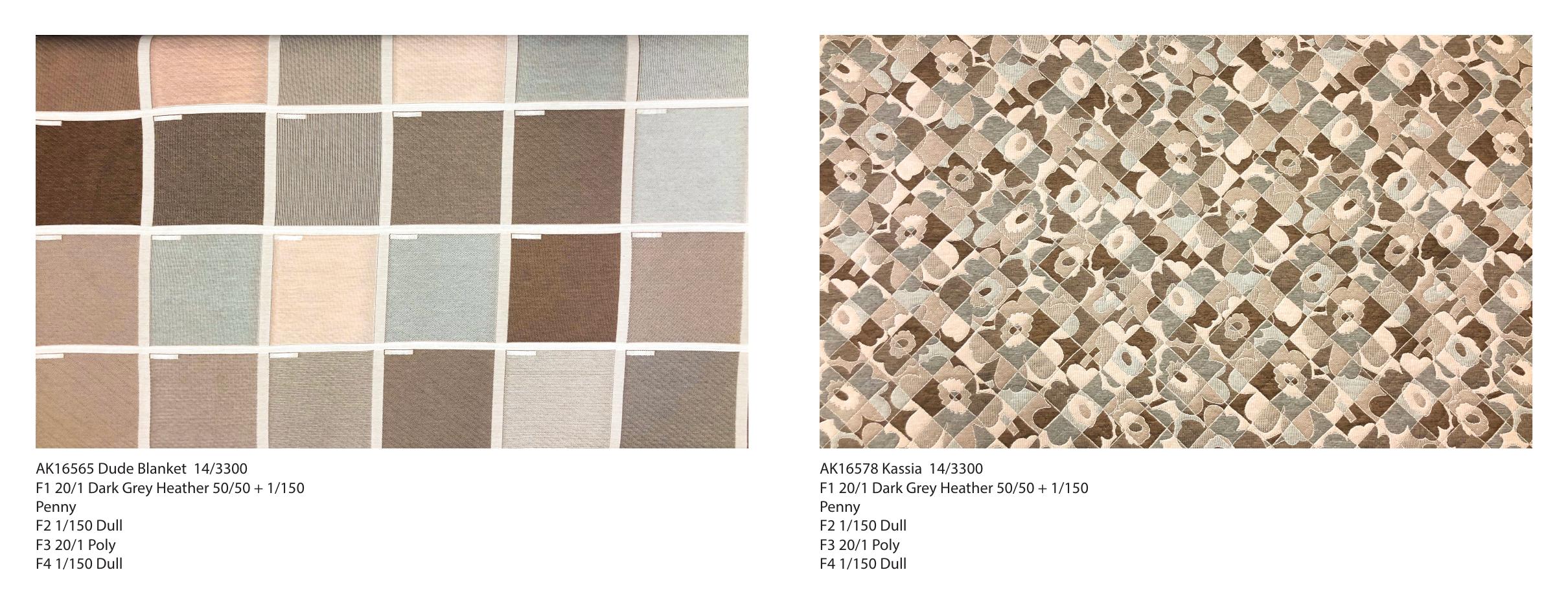
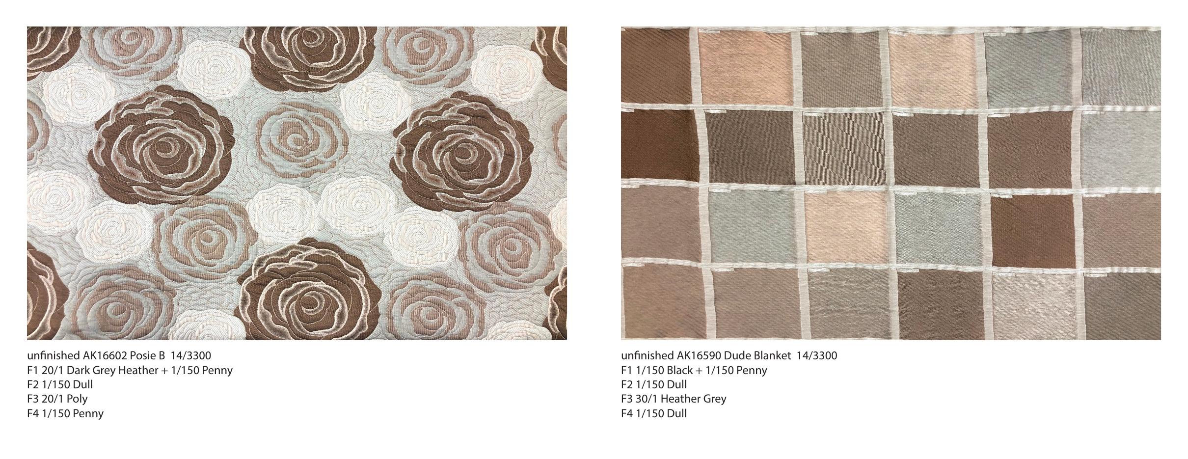
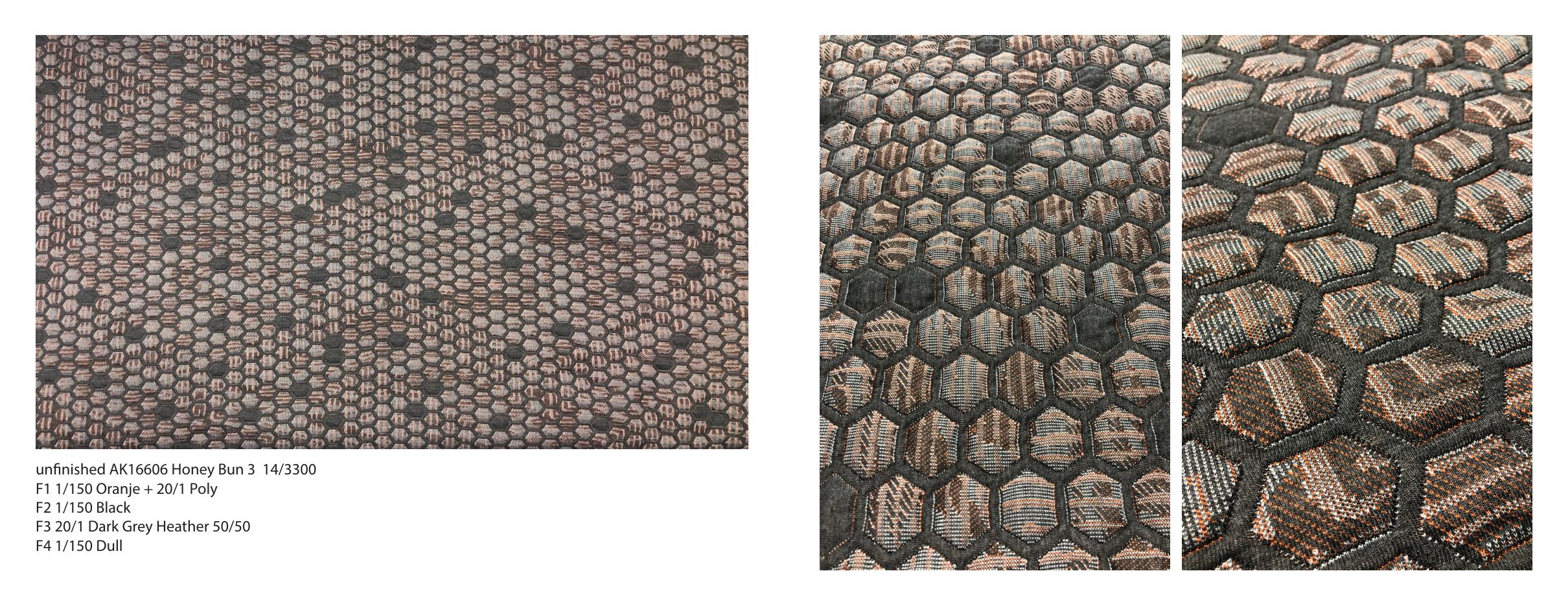
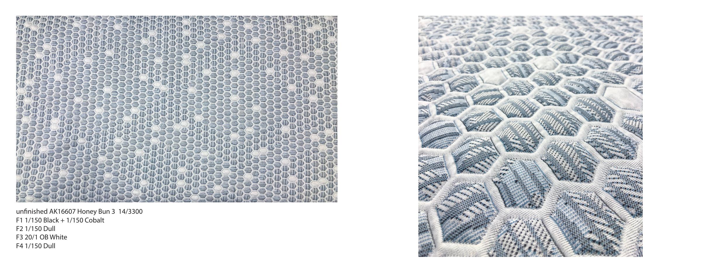
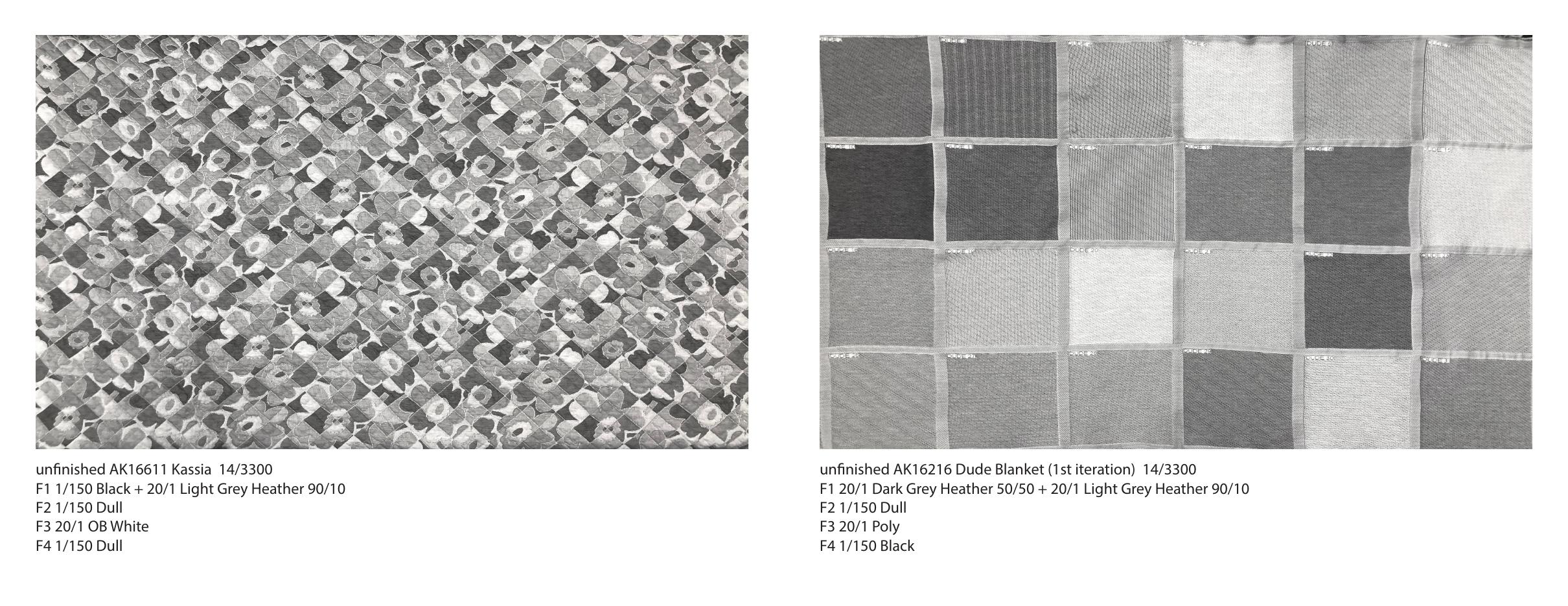
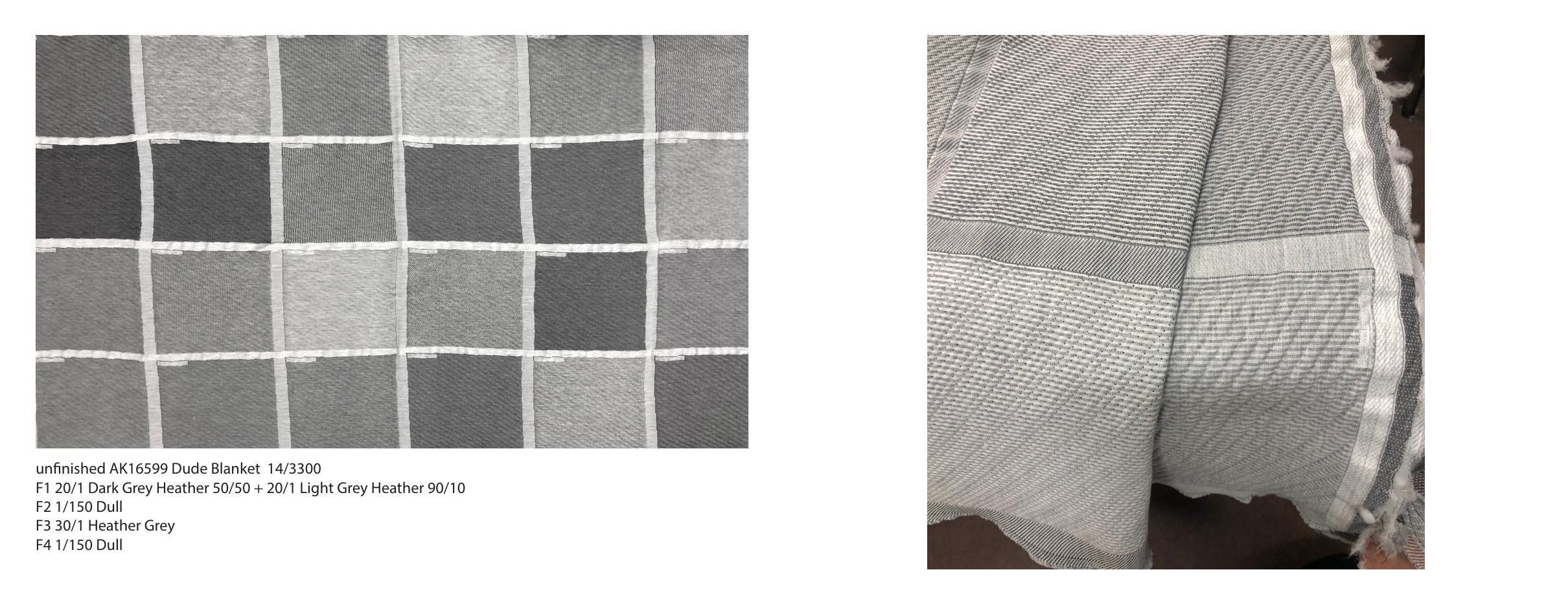
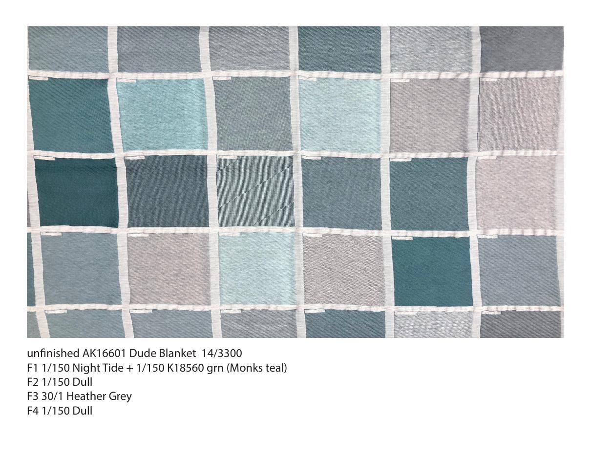
By creating different textures, the fabric gives the illusion of many different colors and shades depending on the yarns used and their placements.

In this development I found it was best to use a shade gradient of colors from light, medium-light, medium-dark and dark. This could be executed with tonally similar yarns or different tones. This created the greatest range and variance in color + texture options.

Kaleidoscope
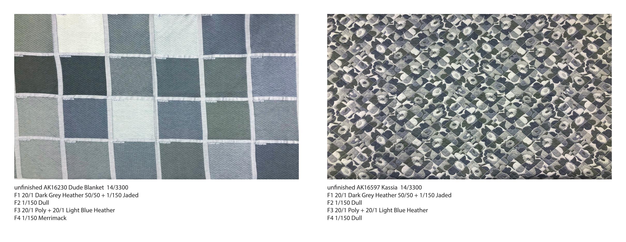
Texture blanket, consisting of 30/1 light heather grey + 1/150 teal poly and 20/1 light heather blue + 20/1 dark heather blue. Each square has a unique visual as a result of different combinations of yarn and texture design.
Kaleidoscope
Knit file of texture blanket.
Kaleidoscope
A rendering demonstrating the design to a potential customer.
Kaleidoscope
Kaleidoscope
Kaleidoscope
Mattress Grove, a local brand purchased the design with some slight adjustments to coloration, toning down the vibrant teal and punching up the blues. Here is their fully fabricated bed.
Kaleidoscope
The textures remain the same as original, but the bright teal yarn is substituted for a rich blue yarn.
Kaleidoscope
Kaleidoscope
Kaleidoscope
Kaleidoscope
Kaleidoscope
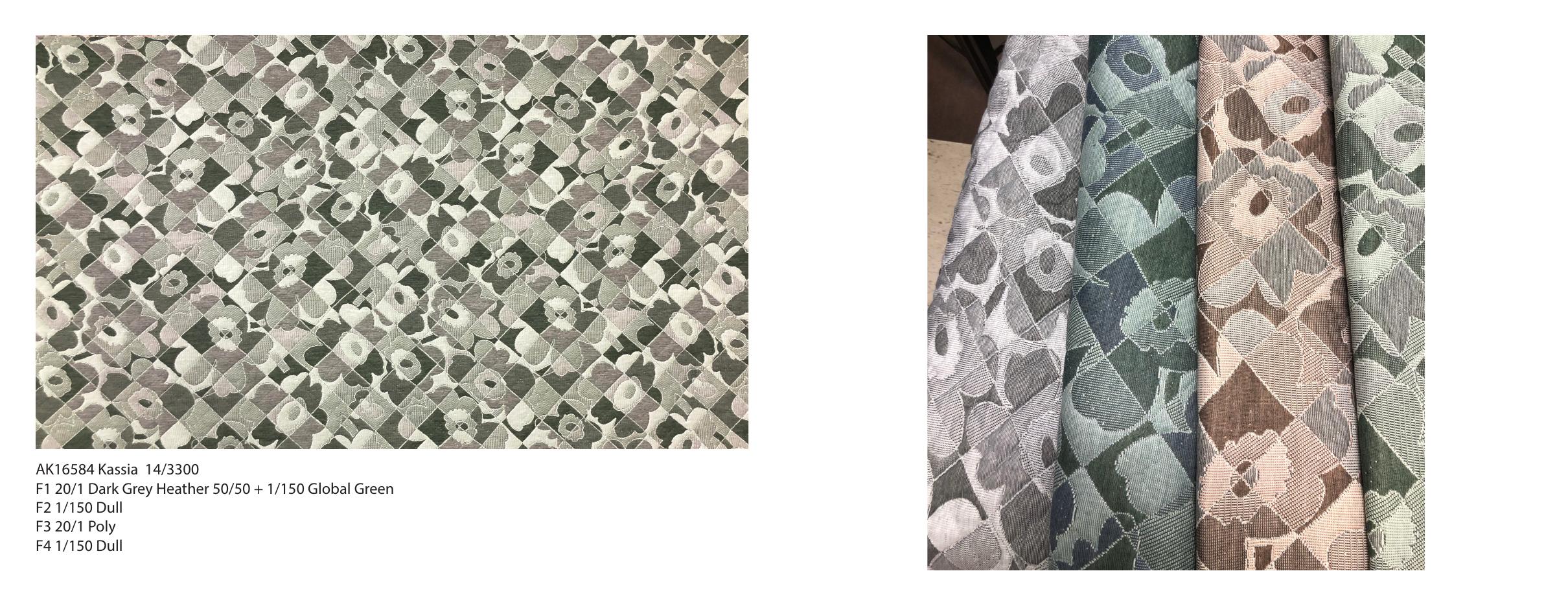
This and the following are alternate color explorations of the Kaleidoscope technique as a result of further iteration on the texture blanket in more colorways.
Kaleidoscope
Kaleidoscope
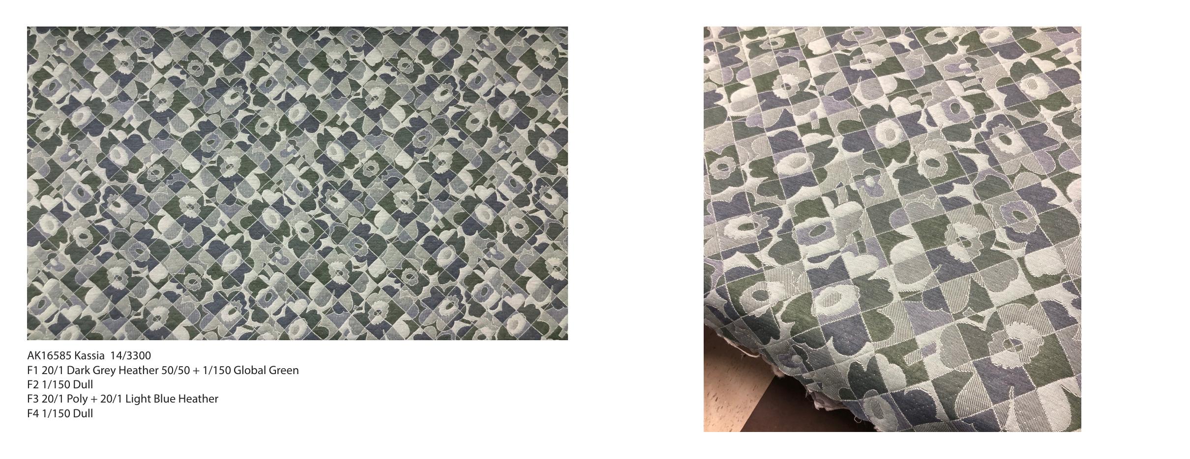
A more delicate application of the Kaleidoscope technique on a Marimekko inspired knit design.
Kaleidoscope
Close up of Kaleidoscope knit file.